Hi,
welcome to the second in a series of articles where I talk about some noteworthy technical problems I encountered during the development of my video game Syzygy. In this part, we are going to address how sprites are rendered and some interesting consequences that arise from the method used.
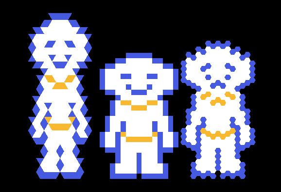
Remember that our initial goal was to have every element in the game reflect the change in shape and we put quite some effort into animating the game map. A really simple idea comes to mind: maps are made by square tiles and sprites are made by square pixels; therefore, we can just draw the sprites as if they were maps. The small caveat is that we must reduce to zero the spaces between shapes, making them all contiguous.
Obviously, turning every pixel into a full-fledged polygon is very costly, but there are some mitigating factors that render the whole endeavor possible:
- sprites are extremely small (never more than 32 pixels in any dimension, often much less);
- being a puzzle game, levels tend to be small and with only few moving pieces;
- GPUs are fast and the task at hand is much lighter than drawing an entire 3D scene in a triple-A game.
The frame rate still tends to drop for old laptops with integrated graphic cards but, being Syzygy a meditative game with little action in it, having a consistent frame rate is enough to guarantee a smooth player experience. I plan to expand on this topic in the next part, but for now it is sufficient to say that for any modern hardware the game can run at 60 fps with little effort, even without custom optimizations on my part.
Since I were at it, I went on and made a pixel art font rendered with the same method as sprites are. In the end, everything in Syzygy is drawn based the current shape, even the menus and GUI buttons.
Problems
It all looks quite fine on paper, but in reality just producing pixel art assets and drawing them using different shapes resulted in the most ugly and deformed characters imaginable.
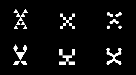
On hexagons, outlines and lines of pixels tend to be broken in many places, producing an unpleasant effect; while, on triangles, badly placed pixels make the sprite look as if it was full of spikes. The following example is so distorted that a smiling face is turned into a sad one.
This phenomenon is especially bad in the pixel-art font, where letters change so drastically that they can morph into complete garbage. Below, you can see the letter X as an example: on top the naive version, on the bottom what I find to be the best looking option.
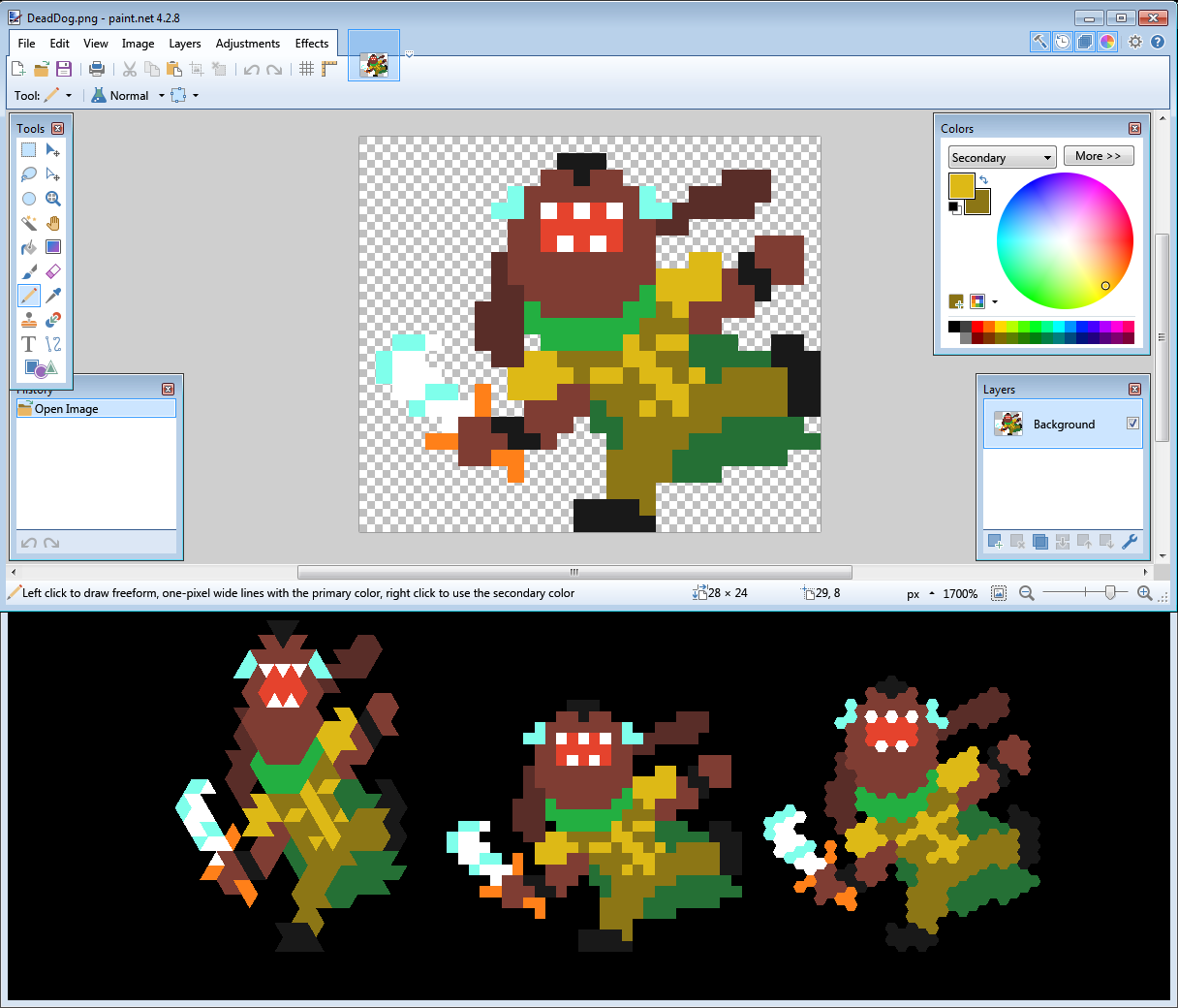
To help me mitigate this problem, I built a small tool that just shows how a sprite would look in any of the three shapes at the same time, so that I could keep it open while drawing to have immediate feedback on the changes I was making.
Working with this tool soon brought me to a couple of realizations: the first one was to remove all outlines, because there was no hope of making them work, and the second one was a simple trick that somewhat reduced the constraints I was subject to.
In the previous part, we talked about how we had to pick which columns were higher on the hexagons and if the first triangle had its tip upwards or downwards. Well, it turns out that we can introduce an offset in both x and y to alter this choice and make the sprites look slightly different. It is also possible to use offsets that keep unchanged the triangular version, while modifying the hexagonal one, and vice versa.
More precisely, the change is subject to the following equations:
column_high = offset_x mod 2
tip_down = (offset_x + offset_y) mod 2
leading to four possible combinations:
- Tip up and column low -> offset (0, 0)
- Tip down and column high -> offset (1, 0)
- Tip down and column low -> offset (0, 1)
- Tip up and column high -> offset (1, 1)
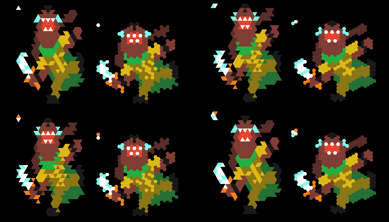
This is very useful because it means we can pick the best looking polygon arrangement for every shape and, if something looks bad in a certain position, we can try to offset it to make it look better.
As a side note, this technique also becomes useful while designing a level to make the map have certain constraints in specific positions. This last statement implies that the game world is not invariant for translation: offsetting a level by one tile effectively creates a new level with potentially different solutions.
Animations
As we said, drawing a polygon for every pixel in the game is costly, but it also gives us complete control on those pixels, allowing us to produce some neat graphical effects basically for free. I tried to exploit this peculiarity as much as possible in various animations. Let’s see a few examples.
Fade
A very simple one is the fade in/out effect: every pixel is shrunk progressively, making the sprite disappear. In game, all these animations are pretty fast, having a length measurable in tenths of second, but the effect is still fairly perceivable.
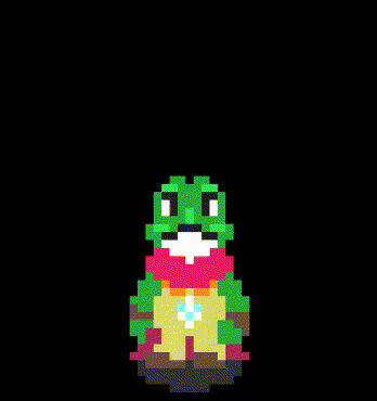
Teleportation
When transitioning from a level to another, the player and text disappear with a “teleporting” effect where the topmost pixels are sent flying upwards and their dimension is progressively shrunk until they disappear. This is repeated row by row until the entire sprite is removed from view.

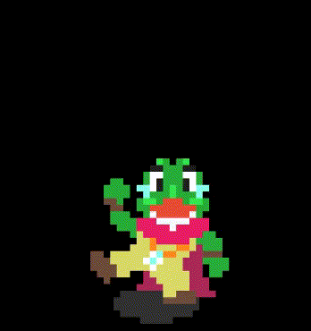
Explosion
The death animation is a disgregating explosion in which the sprite is rapidly magnified while the size of every single pixel is decreased even faster.
And with this animation showcase we conclude our analysis of sprite rendering.
Thank you for your time and I hope it has been a fun ride. Stay tuned for the last part: a mixed bag in which we’ll talk about backgrounds, resolution, color blindness and optimization.